Statistical Machine Learning
Assessing Model Accuracy
UFPE
Assessing Model Accuracy
A key aim of this course is to introduce a wide range of statistical learning methods that extend far beyond the standard linear regression approach.
Why is it necessary to introduce so many different statistical learning approaches, rather than just a single best method?
There is no free lunch in statistics: no one method dominates all others over all possible data sets.
On a particular data set, one specific method may work best, but some other method may work better on a similar but different data set.
Assessing Model Accuracy
Hence it is an important task to decide for any given set of data which method produces the best results.
Selecting the best approach can be one of the most challenging parts of performing statistical learning in practice.
We will discuss some of the most important concepts that arise in selecting a statistical learning procedure for a specific data set.
We’ll cover:
Measuring the Quality of Fit: How to evaluate model performance.
The Bias-Variance Trade-Off: A fundamental concept in model selection.
Measuring the Quality of Fit
In order to evaluate the performance of a statistical learning method on a given data set, we need some way to measure how well its predictions actually match the observed data.
We need to quantify the extent to which the predicted response value for a given observation is close to the true response value for that observation.
Mean Squared Error (MSE)
In the regression setting, the most commonly-used measure is the mean squared error (MSE):
\[ \text{MSE} = \frac{1}{n} \sum_{i=1}^{n} (y_i - \hat{f}(x_i))^2 \]
where:
- \(y_i\) is the true response value for the \(i\)-th observation.
- \(\hat{f}(x_i)\) is the prediction that our model \(\hat{f}\) gives for the \(i\)-th observation. \(\hat{f}\) represents our estimated function.
- \(n\) is the total number of observations.
The MSE is the average of the squared differences between the predicted and actual values.
Interpreting MSE
- Low MSE: The predicted responses are, on average, very close to the true responses (good fit). The smaller the MSE, the smaller the typical deviation of predictions from the true values.
- High MSE: For some observations, the predicted and true responses differ substantially (poor fit). A larger MSE indicates larger average discrepancies between predictions and true values.
The Risk Function:
Measuring Performance
How do we measure how well a prediction function \(\hat{f}: \mathbb{R}^p \to \mathbb{R}\) performs?
We need a criterion. In regression, we often use a Loss Function \(\mathcal{L}(predicted, actual)\) to quantify the error for a single prediction.
Examples:
- Quadratic Loss: \(\mathcal{L}(\hat{f}(X), Y) = (Y - \hat{f}(X))^2\)
- Absolute Loss: \(\mathcal{L}(\hat{f}(X), Y) = |Y - \hat{f}(X)|\)
The Risk of a function \(\hat{f}\) is its expected loss over data \((X, Y)\).
\[R(\hat{f}) = E[\mathcal{L}(\hat{f}(X), Y)]\]
The Risk Function: (Quadratic Loss)
Using the quadratic loss, the prediction in this case is called the Mean Squared Error (MSE):
\[R(\hat{f}) = E[(Y - \hat{f}(X))^2]\]
- The expectation is taken over the joint distribution of \((X, Y)\).
Prediction Risk
and Regression Estimation
Let \((X_{new}, Y_{new})\) a new observation not used to estimate or train \(\hat{f}\)
Using the quadratic loss, the prediction risk in this case is called the MSE of prediction:
\[R_{pred}(\hat{f}) = E[(Y_{new} - \hat{f}(X_{new}))^2]\]
- The lower the risk \(R_{pred}(\hat{f})\), the better the prediction function \(\hat{f}\).
Prediction Risk
and Regression Estimation
Minimizing prediction risk (with quadratic loss) \(R_{pred}(\hat{f})\) is closely related to estimating the regression function \(f(x) = E[Y|X=x]\).
Let’s define the regression risk as the MSE for estimating \(f(X)\):
\[R_{reg}(\hat{f}) = E \left[ \left(f(X) - \hat{f}(X) \right)^2\right]\]
The following theorem formalizes the connection.
Prediction Risk
and Regression Estimation
Theorem 1: Suppose we define the prediction risk of \(\hat{f}: \mathbb{R}^p \to \mathbb{R}\) via quadratic loss: \(R_{pred}(\hat{f}) = E \left[ \left(Y - \hat{f}(X) \right)^2\right]\), where \((X, Y)\) is a new observation. Let the regression risk be \(R_{reg}(\hat{f}) = E \left[ \left(f(X) - \hat{f}(X) \right)^2\right]\), where \(f(X) = E[Y|X]\). Then:
\[R_{pred}(\hat{f}) = R_{reg}(\hat{f}) + E[Var[Y|X]]\]
1
Prediction Risk
and Regression Estimation
Proof.: \[ \begin{aligned} R_{pred}(\hat{f}) &= E\left[\left(Y - \hat{f}(X)\right)^2\right] \\ &= E\left[\left(Y - f(X) + f(X) - \hat{f}(X)\right)^2\right] \\ &= E\left[ \left(f(X) - \hat{f}(X)\right)^2 + \left(Y - f(X)\right)^2 + 2 \left(f(X) - \hat{f}(X) \right) \left(Y - f(X) \right) \right] \\ &= E\left[\left(f(X) - \hat{f}(X) \right)^2 \right] + E\left[\left(Y - f(X) \right)^2 \right] + 2 E\left[\left(f(X) - \hat{f}(X) \right) \left( Y - f(X) \right) \right] \end{aligned} \]
Prediction Risk
and Regression Estimation
Now consider the cross term, using the Law of Total Expectation1: \[E[A] = E[E[A|X]]\]
\[ \begin{aligned} E \left[ \left(f(X) - \hat{f}(X) \right) \left(Y - f(X) \right) \right] &= E\Big[ E \left[ \left( f(X) - \hat{f}(X) \right) \left( Y - f(X) \right) | X \right] \Big] \\ &= E\Big[ \left( f(X) - \hat{f}(X) \right) \underbrace{E \left[ \left( Y - f(X) \right) | X \right]}_{= E[Y|X] - f(X) = 0} \Big] \\ &= E \left[ \left( f(X) - \hat{f}(X) \right) \cdot 0 \right] = 0 \end{aligned} \]
Prediction Risk
and Regression Estimation
So, the cross term is zero. We are left with:
\[R_{pred}(\hat{f}) = E[(f(X) - \hat{f}(X))^2] + E[(Y - f(X))^2]\]
The first term is the definition of the regression risk: \[E[(f(X) - \hat{f}(X))^2] = R_{reg}(\hat{f})\]
The second term is the expected conditional variance: \[E[(Y - f(X))^2] = E[ E[ (Y - f(X))^2 | X ] ] = E[Var[Y|X]]\]
Therefore: \[R_{pred}(\hat{f}) = R_{reg}(\hat{f}) + E[Var[Y|X]]\]
\(\square\)
Implication of Theorem 1
\[R_{pred}(\hat{f}) = \underbrace{E \left[ \left( f(X) - \hat{f}(X) \right)^2 \right]}_{R_{reg}(\hat{f}) \text{ (Reducible Error)}} + \underbrace{E \left[ Var[Y|X] \right]}_{\text{Irreducible Error}}\]
- The term \(E \left[Var[Y|X] \right]\) represents the inherent variability of \(Y\) around its mean \(f(X)\). It does not depend on our choice of prediction function \(\hat{f}\). This is the lowest possible prediction error achievable, even if we knew the true \(f(x)\).
- Minimizing the prediction risk \(R_{pred}(\hat{f})\) is equivalent to minimizing the regression risk \(R_{reg}(\hat{f})\).
- The best possible prediction function under quadratic loss is the true regression function \(\hat{f}(x) = f(x)\), as this makes \(R_{reg}(\hat{f}) = 0\).
\[\underset{\hat{f}}{\operatorname{arg min}} R_{pred}(\hat{f}) = \underset{\hat{f}}{\operatorname{arg min}} R_{reg}(\hat{f}) = f(x)\]
Frequentist Interpretation
Conditional Risk
Why is low conditional risk \(R(\hat{f}) = E \left[\mathcal{L}(\hat{f}(X), Y) \right]\) desirable?
Imagine we observe a large, new (validation) set of data \((X_{n+1}, Y_{n+1}), \dots, (X_{n+m}, Y_{n+m})\), drawn i.i.d from the same distribution as \((X, Y)\).
By the Law of Large Numbers, if \(m\) is large, the average loss on this new data will approximate the risk:
\[ \frac{1}{m} \sum_{i=1}^{m} \mathcal{L}(\hat{f}(X_{n+i}), Y_{n+i}) \approx R(\hat{f}) \]
So, if \(R(\hat{f})\) is small, we expect \(\hat{f}(X_{new}) \approx Y_{new}\) on average for future observations. This holds for any loss function \(\mathcal{L}\).
The Goal of Predictive Modeling
The objective of methods from a predictive viewpoint is, therefore:
To provide methods that yield good estimators \(\hat{f}\) of the true function \(f(x)\), meaning estimators with low risk \(R(\hat{f})\).
In practice, we don’t know \(f(x)\) and can’t calculate \(R(\hat{f})\) exactly, so we need ways to estimate risk or choose models that are likely to have low risk on unseen data1.
Overfitting, Underfitting and Good fit.
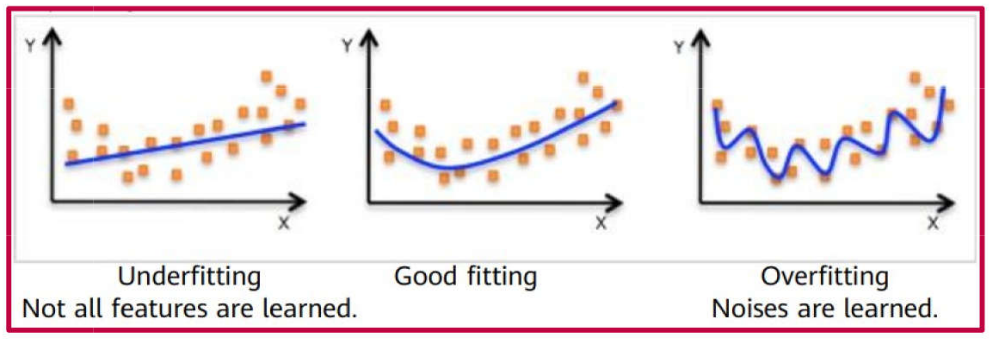
Overfitting
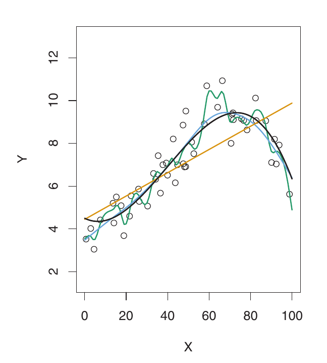
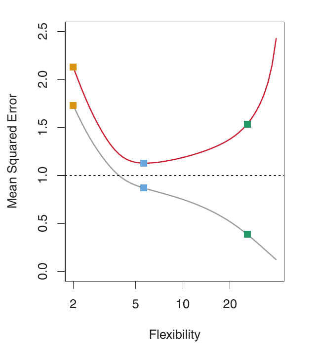
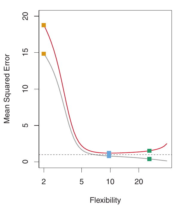
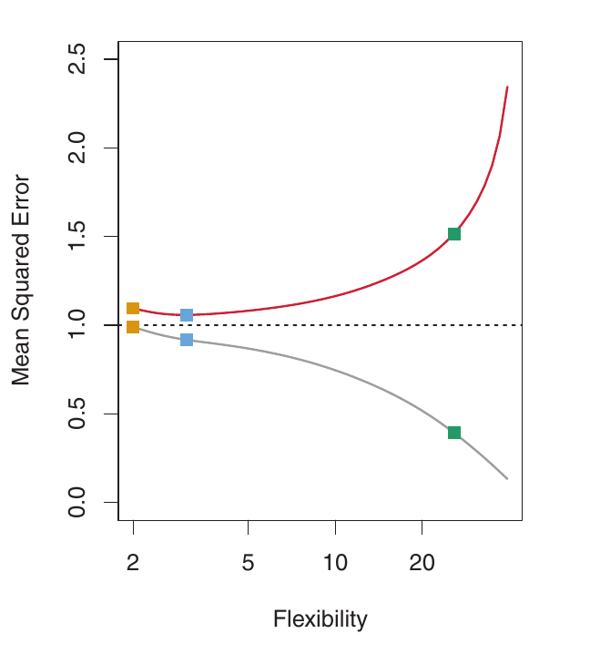
Left: Simulated data. Black curve is the true f. Orange: linear regression. Blue & Green: smoothing splines with different flexibility.
Right: Grey: Training MSE. Red: Validation MSE. Dashed: Minimum possible validation MSE. Squares show training/validation MSE for the fits on the left.
Overfitting - Understanding
- As flexibility increases, the curves fit the observed data more closely. The model is able to capture more complex relationships.
- The green curve is the most flexible – it fits the training data very well, but it’s too wiggly and poorly estimates the true f (black curve). This is overfitting. The model is capturing noise, not just the underlying signal.
- The training MSE (grey curve) decreases monotonically as flexibility increases. This is always the case – a more flexible model can always fit the training data better. This is misleading!
- The validation MSE (red curve) initially decreases, then increases in a U-shape. This is the key behavior we want to understand.
- The blue curve minimizes the validation MSE – it represents the best balance between fitting the training data and generalizing to unseen data.
Overfitting - A Fundamental Problem
- When a method yields a small training MSE but a large validation MSE, we are overfitting the data.
- The model is working too hard to find patterns in the training data, and may be picking up patterns due to random chance (noise) rather than true properties of the unknown function f. It’s memorizing the training data instead of learning the general relationship.
- Overfitting means the patterns found in the training data don’t exist in the validation data, leading to high validation MSE. The model generalizes poorly.
- Training MSE is almost always smaller than validation MSE, because most methods directly or indirectly minimize training MSE.
- Overfitting refers to the case when a less flexible model would yield a lower Validation MSE.
Underfitting
- The opposite of overfitting is underfitting.
- A model underfits when it is not flexible enough to capture the underlying trend in the data.
- This results in high bias. The model is too simplistic and misses important patterns. The model makes systematic errors.
Underfitting
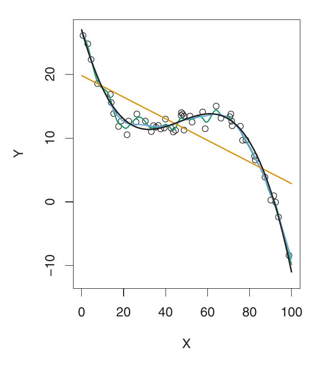
Here, f is highly non-linear. Both training and validation MSE decrease rapidly before the validation MSE starts to increase slowly. More flexibility is needed than in the previous example. The linear model is underfitting.
Good Fitting
Example: Nearly Linear Data
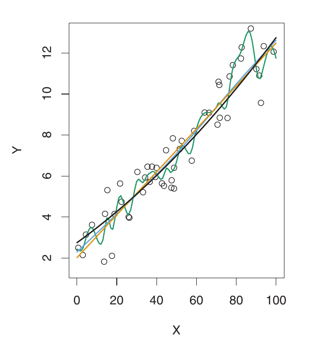
Here, the true f is much closer to linear. Linear regression provides a good fit. The validation MSE decreases only slightly before increasing. The simple linear model performs best. The more flexible models are overfitting to noise.
Estimating Validation MSE in Practice
- In practice, we usually don’t have a large, designated validation set readily available.
- The flexibility level corresponding to the minimum validation MSE varies considerably between datasets.
- We need methods to estimate the validation MSE using the available training data.
Two common approaches:
- Data Splitting (and Validation Sets)
- Cross-Validation
Estimating Validation MSE in Practice
- In practice, we usually don’t have a large, designated validation set readily available.
- The flexibility level corresponding to the minimum validation MSE varies considerably between datasets.
- We need methods to estimate the validation MSE using the available training data.
Two common approaches:
Data Splitting (and Validation Sets)
- Cross-Validation
Data Splitting
A simple strategy to estimate validation error is data splitting:
- Randomly divide the available data into two parts:
- Training set: Used to fit (train) the model.
- Validation set: Used to estimate the validation error. Not used for fitting the model.
Fit the model using the training set. This means estimating any parameters of the model (e.g., coefficients in linear regression).
Predict the responses for the observations in the validation set using the fitted model.
Calculate the MSE (or other error metric) on the validation set. This provides an estimate of the validation MSE.
Data Splitting
Suppose we have \(n\) observations: \((x_1, y_1), (x_2, y_2), ..., (x_n, y_n)\).
We might split the data into:
- Training set (e.g., 70%): \((x_1, y_1), ..., (x_s, y_s)\)
- Validation set (e.g., 30%): \((x_{s+1}, y_{s+1}), ..., (x_n, y_n)\)
We estimate the risk, \(\hat{R}(f)\), which is an approximation of the true risk \(R(f)=E[\mathcal{L}(f(X);Y)]\), using the validation set:
\[ \hat{R}(f) = \frac{1}{n-s} \sum_{i=s+1}^{n} (y_i - \hat{f}(x_i))^2 \]
where \(\hat{f}\) is the model fit using the training data only, and the sum is over the validation set.
Data Splitting: Considerations
- Randomization: It’s crucial to split the data randomly. A non-random split could lead to a biased estimate of validation error.
- Training/Validation Split: The proportion of data allocated to training and validation can vary (e.g., 70/30, 80/20). There’s a trade-off:
- More data in the training set generally leads to a better model fit (lower bias).
- More data in the validation set generally leads to a better estimate of the validation error (lower variance in the estimate).
The Bias-Variance Trade-Off
The U-shape observed in the validation MSE curves (Figures below) is a result of two competing properties of statistical learning methods: bias and variance.
Variance Impact
Variance refers to the amount by which \(\hat{f}\) would change if we estimated it using a different training data set.
Ideally, the estimate for f should not vary too much between training sets. The model should be relatively stable.
High variance: Small changes in the training data can result in large changes in \(\hat{f}\). The model is very sensitive to the specific training data it sees.
More flexible statistical methods generally have higher variance. They can fit the training data very closely, but this can lead to overfitting and high variability.
Bias Impact
Bias refers to the error introduced by approximating a real-life problem (which may be very complex) with a simpler model.
- Example: Linear regression assumes a linear relationship. If the true relationship is far from linear, there will be bias. The linear model is systematically wrong.
- More flexible methods generally result in less bias. They can capture more complex relationships in the data.
The Trade-Off
- General rule: As we use more flexible methods, variance increases and bias decreases.
- The relative rate of change of these two quantities determines whether the validation MSE increases or decreases.
- Initially, as flexibility increases, bias decreases faster than variance increases. This leads to a decrease in the expected validation MSE.
- At some point, increasing flexibility has little impact on bias, but significantly increases variance. This is where overfitting starts. The expected validation MSE starts to increase.
Visualizing the Trade-Off
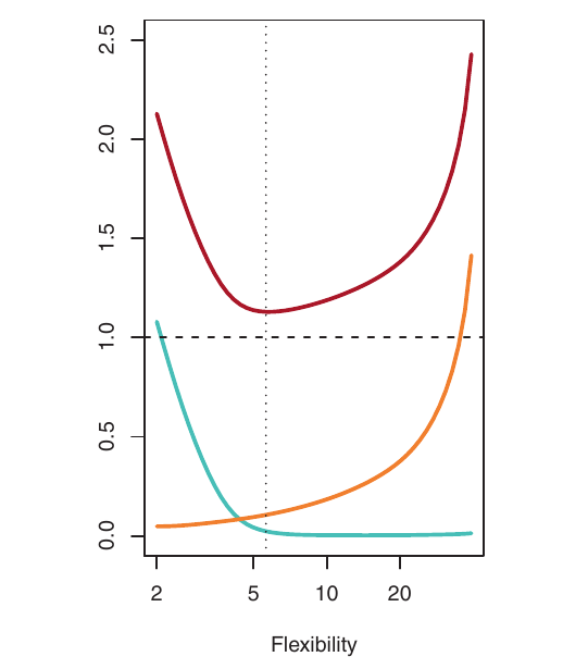
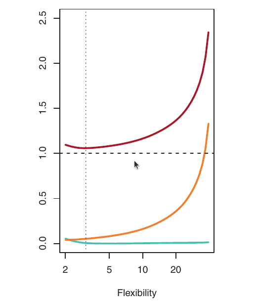
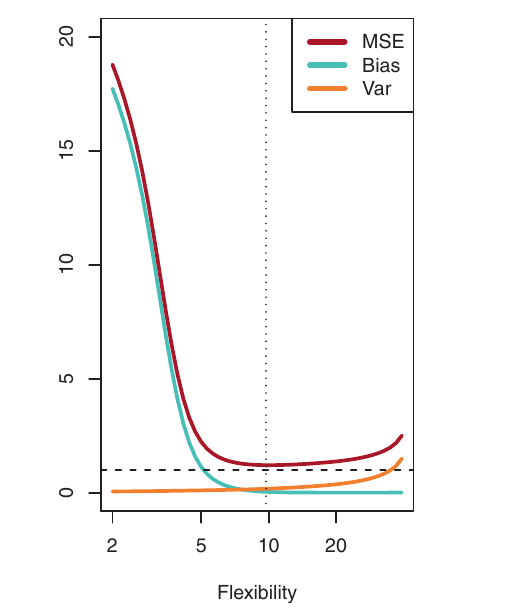
- Blue: Squared Bias
- Orange: Variance
- Dashed: Var(\(\epsilon\)) (irreducible error)
- Red: validation MSE (sum of the above)
The optimal flexibility level (where validation MSE is minimized) differs across datasets, depending on the true f and the noise level.
Bias-Variance Trade-Off: Summary
- Finding a good model requires low variance and low bias.
- This is a trade-off because it’s easy to get:
- Low bias with high variance: (e.g., a curve that interpolates every training point – highly flexible, overfits).
- Low variance with high bias: (e.g., a horizontal line – very inflexible, underfits).
- The challenge is finding a method with both low variance and low bias. This requires choosing the right level of model complexity.
Classification
Training Error Rate
So far, we’ve focused on regression (where the response variable \(Y\) is quantitative). The concepts of bias-variance trade-off also apply to classification (where \(Y\) is qualitative), with some modifications.
In classification, the most common measure of accuracy is the training error rate:
\[ \frac{1}{n} \sum_{i=1}^{n} I(y_i \neq \hat{y}_i) \]
- \(\hat{y}_i\) is the predicted class label for the \(i\)-th observation (using our fitted classifier).
- \(I(y_i \neq \hat{y}_i)\) is an indicator variable:
- \(I(y_i \neq \hat{y}_i) = 1\) if \(y_i \neq \hat{y}_i\) (misclassification).
- \(I(y_i \neq \hat{y}_i) = 0\) if \(y_i = \hat{y}_i\) (correct classification).
- This is the fraction of incorrect classifications on the training data.
Validation Error Rate
As in regression, we are most interested in the error rate on validation observations:
\[ \text{Ave}(I(\mathbf{y} \neq \mathbf{\hat{y}})) = \frac{1}{n_{\text{val}}} \sum_{i \in \mathcal{T}} I(y_i \neq \hat{y}_i) \]
\(\mathbf{\hat{y}}\) is the predicted class label for a validation observation with predictor \(\dot{\mathbf{x}}\).
A good classifier has a low validation error rate.
\(\mathcal{T}\) is the index set of validation observations.
Ave: abbreviation of “Average”
Performance Metrics
The Confusion Matrix
- A table summarizing the performance of a classification model.
- Compares predicted labels against actual (true) labels. Essential for understanding where the model makes mistakes.
Structure (for a binary classification problem):
| Predicted: Positive | Predicted: Negative | Total Actual | |
|---|---|---|---|
| Actual: Positive | TP | FN | TP + FN |
| Actual: Negative | FP | TN | FP + TN |
| Total Predicted | TP + FP | FN + TN | n |
The Confusion Matrix
| Predicted: Positive | Predicted: Negative | Total Actual | |
|---|---|---|---|
| Actual: Positive | TP | FN | TP + FN |
| Actual: Negative | FP | TN | FP + TN |
| Total Predicted | TP + FP | FN + TN | n |
- TP (True Positive): Correctly predicted positive instances (e.g., correctly identified fraud).
- TN (True Negative): Correctly predicted negative instances (e.g., correctly identified non-fraud).
- FP (False Positive / Type I Error): Incorrectly predicted positive (e.g., non-fraud flagged as fraud).
- FN (False Negative / Type II Error): Incorrectly predicted negative (e.g., fraud missed).
Confusion Matrix
Example Calculation
Scenario: Validation set (\(n=100\)), 10 Actual Positive (Minority), 90 Actual Negative (Majority).
Model Predictions:
- Correctly identifies 7 Positive cases (TP = 7).
- Misses 3 Positive cases (predicts them as Negative) (FN = 3).
- Incorrectly flags 2 Negative cases as Positive (FP = 2).
- Correctly identifies 88 Negative cases (TN = 88).
Confusion Matrix
Example Calculation
Confusion Matrix:
| Predicted: Positive | Predicted: Negative | Total Actual | |
|---|---|---|---|
| Actual: Positive | 7 | 3 | 10 |
| Actual: Negative | 2 | 88 | 90 |
| Total Predicted | 9 | 91 | 100 |
- Check:
- TP+FN = 7+3=10 (Actual Pos);
- FP+TN = 2+88=90 (Actual Neg);
- Total = 100.
Confusion Matrix
Example Calculation
Confusion Matrix:
| Predicted: Positive | Predicted: Negative | Total Actual | |
|---|---|---|---|
| Actual: Positive | 7 | 3 | 10 |
| Actual: Negative | 2 | 88 | 90 |
| Total Predicted | 9 | 91 | 100 |
What is the accuracy, and what is its value?
- Accuracy: \(\frac{TP + TN}{n} = \frac{7 + 88}{100} = 95\%\)
High, right?! But let’s look deeper.
Precision
- Question: Of all instances the model predicted as Positive, how many were actually Positive?
Formula: \[Precision = \frac{TP}{TP + FP}\]
Focus: Minimizing False Positives (FP). High precision means the model is trustworthy when it predicts the positive class.
Relevance: Important when the cost of a False Positive is high (e.g., flagging a legitimate transaction as fraud, sending unnecessary alerts).
Precision
\[Precision = \frac{TP}{TP + FP}\]
Using Example:
TP = 7
FP = 2
Predicted Positives = TP + FP = 7 + 2 = 9
Precision: \(\frac{7}{7 + 2} = \frac{7}{9} \approx 0.778\) or 77.8%
Interpretation: When this model predicts “Positive”, it is correct about 77.8% of the time.
Recall
(Sensitivity / True Positive Rate - TPR)
- Question: Of all the actual Positive instances, how many did the model correctly identify?
- Formula: \[Recall = \frac{TP}{TP + FN}\]
- Focus: Minimizing False Negatives (FN). High recall means the model is good at finding the positive instances.
- Relevance: Crucial for imbalanced data where the minority class is important. Essential when the cost of a False Negative is high (e.g., missing a fraudulent transaction, failing to diagnose a disease).
Recall
(Sensitivity / True Positive Rate - TPR)
\[Recall = \frac{TP}{TP + FN}\]
Using Example:
TP = 7
FN = 3
Actual Positives = TP + FN = 7 + 3 = 10
Recall: \(\frac{7}{7 + 3} = \frac{7}{10} = 0.70\) or 70.0%
Interpretation: This model only found 70% of the actual Positive cases. 30% were missed (FN). This highlights the model’s weakness, unlike the 95% accuracy.
\(F_1\)-Score
- Question: How can we combine Precision and Recall into a single metric?
Formula: \[F_1 = 2 \times \frac{Precision \times Recall}{Precision + Recall}\]
Concept: The harmonic mean of Precision and Recall. It gives more weight to lower values, meaning it penalizes models where one metric is high and the other is very low more than a simple average would.
Relevance: Useful when you need a balance between Precision and Recall, and there isn’t a strong reason to prioritize one significantly over the other.
\(F_1\)-Score
\[F_1 = 2 \times \frac{Precision \times Recall}{Precision + Recall}\]
Using Example:
Precision ≈ 0.778
Recall = 0.70
\(F_1\)-Score: \(2 \times \frac{0.778 \times 0.70}{0.778 + 0.70} = 2 \times \frac{0.5446}{1.478} \approx 2 \times 0.368 \approx 0.737\)
Interpretation: The \(F_1\)-Score of 0.737 provides a more balanced view of performance than the 95% accuracy, reflecting the trade-off between the model’s precision and its ability to find positive cases.
MCC
Matthews Correlation Coefficient
- Concept: A correlation coefficient between the observed and predicted binary classifications. It measures the quality of classification, considering all four values in the confusion matrix (TP, TN, FP, FN).
- Formula: \[MCC = \frac{TP \times TN - FP \times FN}{\sqrt{(TP + FP)(TP + FN)(TN + FP)(TN + FN)}}\]
- Range: -1 to +1.
- +1: Perfect prediction.
- 0: No better than random prediction.
- -1: Total disagreement between prediction and observation.
- Advantages: Considered one of the most robust and balanced metrics for imbalanced datasets. It yields a high score only if the classifier performs well on both the minority and majority classes. Less influenced by skewed class distribution compared to Accuracy or F1-Score in some extreme cases.
MCC
Matthews Correlation Coefficient
\[MCC = \frac{TP \times TN - FP \times FN}{\sqrt{(TP + FP)(TP + FN)(TN + FP)(TN + FN)}}\]
Using Example:
- TP = 7, TN = 88, FP = 2, FN = 3
- Numerator: \((7 \times 88) - (2 \times 3) = 616 - 6 = 610\)
- Denominator terms:
- (TP + FP) = 7 + 2 = 9
- (TP + FN) = 7 + 3 = 10
- (TN + FP) = 88 + 2 = 90
- (TN + FN) = 88 + 3 = 91
- Denominator = \(\sqrt{9 \times 10 \times 90 \times 91} = \sqrt{737100} \approx 858.54\)
- MCC: \(\frac{610}{858.54} \approx 0.710\)
Interpretation: The MCC value of 0.71 indicates a reasonably good correlation between the model’s predictions and the actual classes, taking into account both correct and incorrect predictions for both classes in a balanced way.
Cohen’s Kappa Coefficient (\(\kappa\))
- Concept: Measures the agreement between the predicted classifications and the actual classifications, correcting for the agreement that might occur purely by chance.
- Question: How much better is the classifier’s agreement than the agreement expected by random chance?
- Range: Typically -1 to +1, though negative values below 0 are rare in practice.
- κ = 1: Perfect agreement.
- κ = 0: Agreement equivalent to chance.
- κ < 0: Agreement weaker than chance (unusual).
- General Interpretation Guidelines (Landis & Koch): <0 Poor, 0-0.2 Slight, 0.21-0.4 Fair, 0.41-0.6 Moderate, 0.61-0.8 Substantial, 0.81-1 Almost Perfect.
- Formula: \[κ = \frac{P_o - P_e}{1 - P_e}\]
where
\(P_{o}\,=\,{N}^{-1}{\sum_{i\,=\,1}^{c} n_{ii}}\),
\(P_{e}\,=\,{N^{-2}}{\sum_{i\,=\,1}^{c} n_{i+}\, n_{+i}}\),
\(n_{ii}\) is the sum of elements at the main diagonal of the confusion matrix, \(n_{i+}\) is the sum of its elements at \(i\)th row, \(n_{+i}\) is the sum of its elements at \(i\)th column and \(N\) represents the total number of decisions at the confusion matrix.
Cohen’s Kappa Coefficient (\(\kappa\))
\[κ = \frac{P_o - P_e}{1 - P_e}\]
Using Example (TP=7, TN=88, FP=2, FN=3, n=100):
- Observed Accuracy (\(P_o\)): \(\frac{7 + 88}{100} = 0.95\)
- Expected Accuracy (\(P_e\)):
- \(P_e = ([7 \quad 3] \times [7 \quad 2]^\top + [2 \quad 88] \times [3 \quad 88]^\top) / 100^2 = (55 + 7750)/ 100^2 = 0.780\)
- Kappa (κ): \(\frac{0.95 - 0.780}{1 - 0.780} = \frac{0.17}{0.22} \approx 0.773\)
Interpretation: The Kappa value of ~0.77 indicates substantial agreement between the model’s predictions and the actual values. This metric reinforces that the model has learned patterns.
Cohen’s Kappa Coefficient (\(\kappa\))
Multi-Class Classification
\[ \kappa\,=\,\frac{P_{o}\,-\,P_{e}}{1\,-\,P_{e}}, \]
where
\(P_{o}\,=\,{N}^{-1}{\sum_{i\,=\,1}^{c} n_{ii}}\),
\(P_{e}\,=\,{N^{-2}}{\sum_{i\,=\,1}^{c} n_{i+}\, n_{+i}}\),
\(n_{ii}\) is the sum of elements at the main diagonal of the confusion matrix, \(n_{i+}\) is the sum of its elements at \(i\)th row, \(n_{+i}\) is the sum of its elements at \(i\)th column and \(N\) represents the total number of decisions at the confusion matrix.
Which Metric to Use?
- Accuracy: Generally avoid as the primary metric for imbalanced data. Use only if classes are balanced or costs of errors are equal (rare).
- Precision: Prioritize when the cost of False Positives is high.
- Recall (Sensitivity/TPR): Prioritize when the cost of False Negatives is high (often the case for minority classes like fraud/disease).
- \(F_1\)-Score: Use when you need a balance between Precision and Recall.
- MCC (Matthews Correlation Coefficient): A robust metric considering all four confusion matrix entries (TP, TN, FP, FN). Good single-number summary, less sensitive to class skew than F1 in some cases.
- Kappa (Cohen’s κ): Measures agreement relative to what’s expected by chance. Useful in imbalanced settings as it explicitly accounts for the possibility of high “chance agreement” due to a large majority class.
Recommendation: Always look at the Confusion Matrix first.
References
Basics
Aprendizado de Máquina: uma abordagem estatística, Izibicki, R. and Santos, T. M., 2020, link: https://rafaelizbicki.com/AME.pdf.
An Introduction to Statistical Learning: with Applications in R, James, G., Witten, D., Hastie, T. and Tibshirani, R., Springer, 2013, link: https://www.statlearning.com/.
Mathematics for Machine Learning, Deisenroth, M. P., Faisal. A. F., Ong, C. S., Cambridge University Press, 2020, link: https://mml-book.com.
References
Complementaries
An Introduction to Statistical Learning: with Applications in python, James, G., Witten, D., Hastie, T. and Tibshirani, R., Taylor, J., Springer, 2023, link: https://www.statlearning.com/.
Matrix Calculus (for Machine Learning and Beyond), Paige Bright, Alan Edelman, Steven G. Johnson, 2025, link: https://arxiv.org/abs/2501.14787.
Machine Learning Beyond Point Predictions: Uncertainty Quantification, Izibicki, R., 2025, link: https://rafaelizbicki.com/UQ4ML.pdf.
Mathematics of Machine Learning, Petersen, P. C., 2022, link: http://www.pc-petersen.eu/ML_Lecture.pdf.
Machine Learning - Prof. Jodavid Ferreira