Decision Trees: The path from root to leaf is a logical sequence.
Rule-Based Models: “If X and Y, then Z”.
Limitations of Transparent Models
Linearity: Often the real world is non-linear.
Interactions: Small trees don’t capture complex interactions; large trees become unreadable.
Performance: In unstructured data (image, text), these models fail dramatically.
Global Interpretability
Seeks to understand the model’s behavior as a whole.
Question: Which variables are most important for the model in general?
Example: Variable importance based on Gini impurity gain in Random Forests.
Limitation: Can hide divergent local behaviors.
Local Interpretability
Focuses on explaining a single prediction.
Question: Why was this specific patient classified with a high risk of heart attack?
Crucial for personalized decisions.
LIME and SHAP are the main exponents of this approach.
Model-Agnostic vs. Model-Specific
Model-Specific: Methods that depend on the internal structure of the model (e.g., tree paths).
Model-Agnostic: Treat the model as a black box. Work for any algorithm (SVM, XGBoost, Deep Learning).
Advantage of Agnosticism: Full flexibility to swap models without changing the explanation tool.
Explainable AI (XAI)
XAI is the research field that aims to create techniques to make AI results understandable.
Involves:
Data visualization.
Feature importance attribution.
Explanations by counter-examples.
Model distillation.
Explainable AI (XAI)
Interpretability refers to models whose internal logic is transparent and directly understandable by humans (e.g., linear regression or decision trees).
Explainability refers to techniques that provide explanations for predictions of complex or “black-box” models.
Post-hoc Methods
“Post-hoc” means “after the fact”.
We train the best possible model (XGBoost, for example) and, afterwards, apply a technique to extract explanations.
This is the most common approach in the industry today.
LIME: Introduction
LIME: Local Interpretable Model-agnostic Explanations.
Proposed by Ribeiro, Singh, and Guestrin (2016).
Core Idea: “Locally, any complex model can be approximated by a simple linear model.”
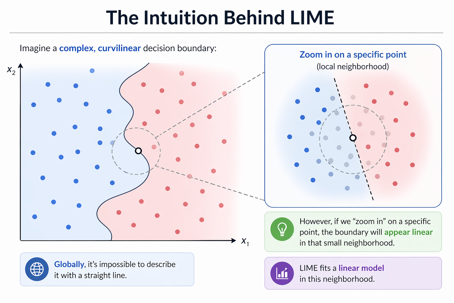
The Intuition Behind LIME
Imagine a complex, curvilinear decision boundary:
Globally, it’s impossible to describe it with a straight line.
However, if we “zoom in” on a specific point, the boundary will appear linear in that small neighborhood.
LIME fits a linear model in this neighborhood.
The Intuition Behind LIME
The LIME Algorithm: Step-by-Step
Select the instance \(x\) you want to explain.
Generate a synthetic dataset by perturbing \(x\).
Obtain predictions from the black-box model for these new points.
Weight the synthetic points according to their proximity to \(x\).
Train a simple linear model (e.g., Lasso) on the weighted points.
The coefficients of this linear model are the explanation.
LIME in R: Setup
We will use the lime package. It integrates well with tidymodels.
library(lime)library(tidymodels)library(ranger)# Load datadata(iris)# Random Forest Modelrf_mod <-rand_forest() |>set_mode("classification") |>set_engine("ranger") |>fit(Species ~ ., data = iris)
Creating the LIME Explainer
The first step is to “teach” LIME how the dataset behaves.
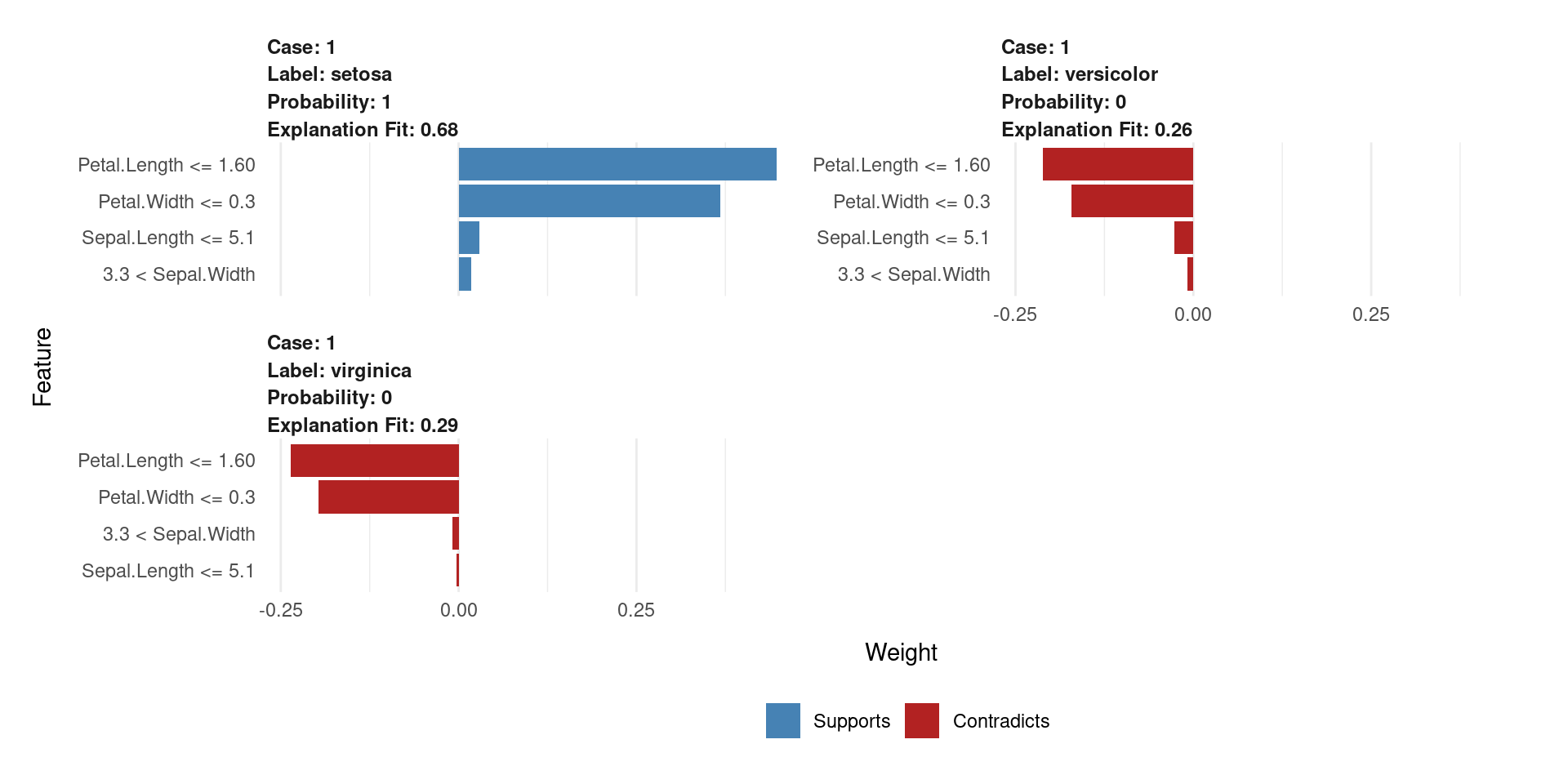
The plot will show which variables (e.g., Petal.Length) support or contradict the “setosa” classification.
LIME Visualization
Each panel explains one prediction locally.
Shows predicted class + probability.
Blue (Supports) → pushes toward the predicted class
Red (Contradicts) → pushes against it
Bar length = feature importance (weight)
LIME fits a local linear model around the instance
Even if the model is complex, locally the decision is interpretable
The DALEX Ecosystem
Another Perspective
DALEX: Descriptive mAchine Learning EXplanations.
Developed by Przemyslaw Biecek.
Provides a consistent grammar for model exploration, inspired by the “Grammar of Graphics” (ggplot2).
Core Idea: Separate the model from the explanation methods via a unified explainer object.
The DALEX Philosophy
Create an explainer: Wrap your model (any model!) in a standardized object. This object contains the model, the data, and metadata.
Use explain() functions: Apply various functions to this explainer to get different types of insights (global or local).
Plot the results: All explanation objects have a plot() method for easy visualization.
DALEX in R: Creating an Explainer
Let’s use the same Random Forest model from the LIME example.
library(DALEX)library(DALEXtra)# Create the explainer for the tidymodels objectdalex_explainer <-explain_tidymodels( rf_mod, data = iris[, -5],y = iris$Species,label ="Random Forest")
Preparation of a new explainer is initiated
  -> model label       :  Random Forest
  -> data              :  150  rows  4  cols
  -> target variable   :  150  values
  -> predict function  :  yhat.model_fit  will be used (  default  )
  -> predicted values  :  No value for predict function target column. (  default  )
  -> model_info        :  package parsnip , ver. 1.3.3 , task multiclass (  default  )
  -> predicted values  :  predict function returns multiple columns:  3  (  default  )
  -> residual function :  residual_function
  -> residuals         :  numerical, min =  0 , mean =  0 , max =  0
  A new explainer has been created!
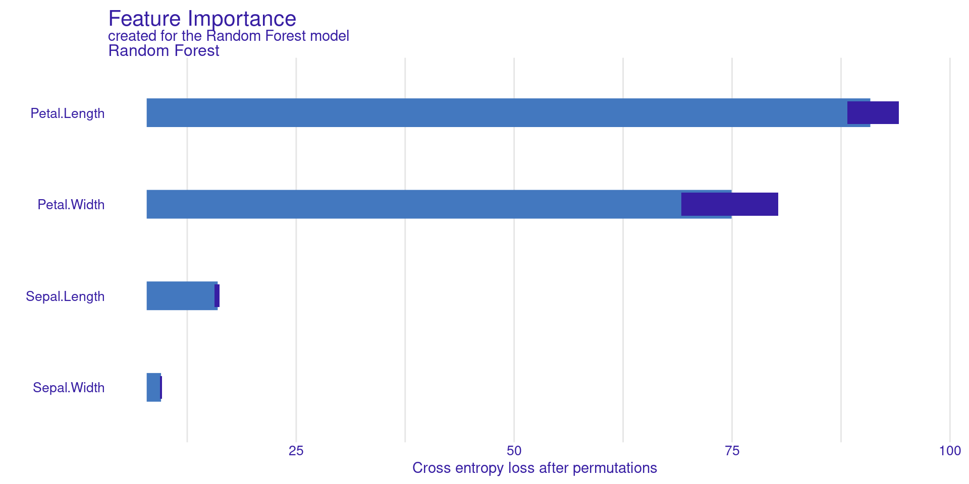
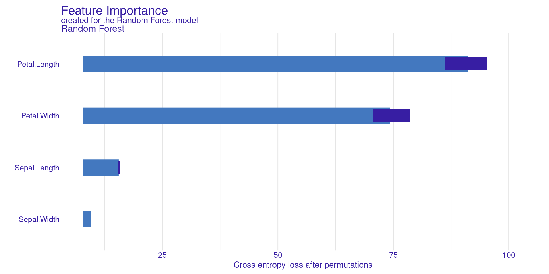
DALEX Global: Variable Importance
model_parts() calculates feature importance based on permutation.
vi_rf <-model_parts(dalex_explainer)plot(vi_rf)
DALEX Global: Variable Importance
Permutation Feature Importance measures how important a feature is by randomly shuffling its values. When a feature is shuffled, its relationship with the target is broken.
The model’s performance is first computed using the original data. Then, the feature is shuffled and the performance is computed again.
If the performance drops a lot, the feature is important. If the performance changes very little, the feature is not important.
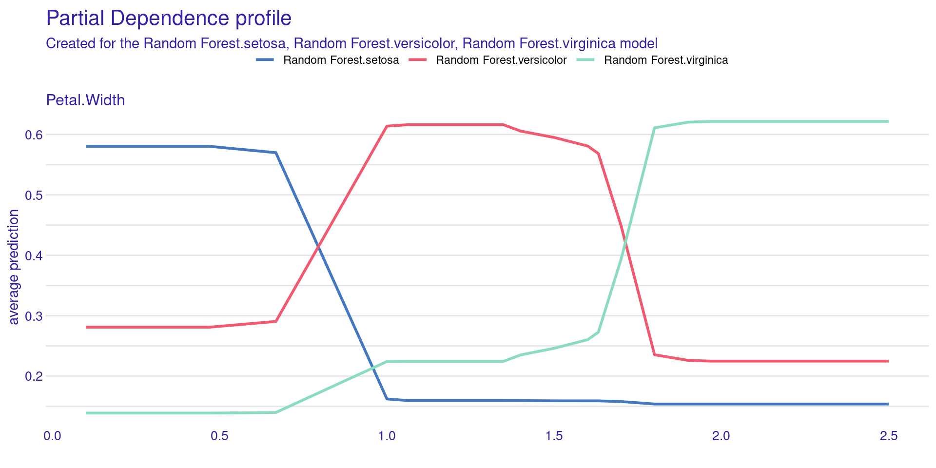
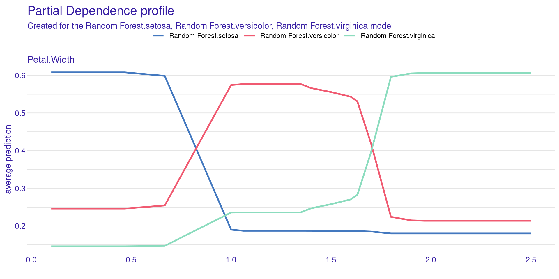
DALEX Global:
Partial Dependence Profiles (PDP)
model_profile() shows how the model’s prediction changes on average as you change a single feature.
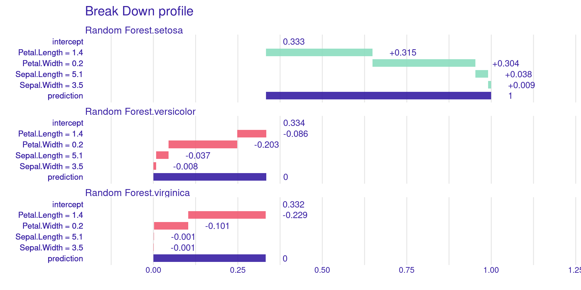
Where \(M = |F|\) is the total number of features and \(S \subseteq F \setminus \{i\}\) is a subset of features, \(|S|\) is the number of features in subset \(S\), and \(|S|!\) is its factorial. The term \(v(S)\) represents the model prediction using only the features in \(S\), while \(v(S \cup \{i\})\) is the prediction after adding feature \(i\) to \(S\). Thus, \(v(S \cup \{i\}) - v(S)\) measures the marginal contribution of feature \(i\).
Property: Local Accuracy
The sum of each variable’s contributions (SHAP values) plus the base value must be exactly equal to the model’s prediction:
\[f(x) = \phi_0 + \sum_{i=1}^M \phi_i\]
This ensures that the explanation is faithful to the predicted value. If a variable is not present in the model (or has no effect), its SHAP value must be zero.
KernelSHAP vs. TreeSHAP
KernelSHAP: Model-agnostic approach (uses sampling and weighted linear regression, similar to LIME, but with weights derived from the Shapley formula).
TreeSHAP: Optimized algorithm for tree-based models (XGBoost, Random Forest). It is extremely fast and exact.
SHAP in R: Packages
fastshap: Fast and versatile, especially for xgboost.
shapviz: Excellent for modern visualizations.
DALEX: Can compute SHAP for any model via predict_parts().
SHAP Example: Setup
library(xgboost)library(fastshap)library(shapviz)# Using the penguins datasetlibrary(palmerpenguins)df <-na.omit(penguins)
Training an XGBoost Model
X <-model.matrix(body_mass_g ~ . -1, data = df)y <- df$body_mass_gmod <-xgboost(data = X, label = y, nrounds =20, verbose =0)
Calculating SHAP Values with fastshap
# Using fastshap for speed with XGBoost# Função wrapper de prediçãopred_wrapper <-function(object, newdata) {predict(object, newdata =as.matrix(newdata))}shap_vals <- fastshap::explain(mod, X = X, nsim =1, pred_wrapper = pred_wrapper)
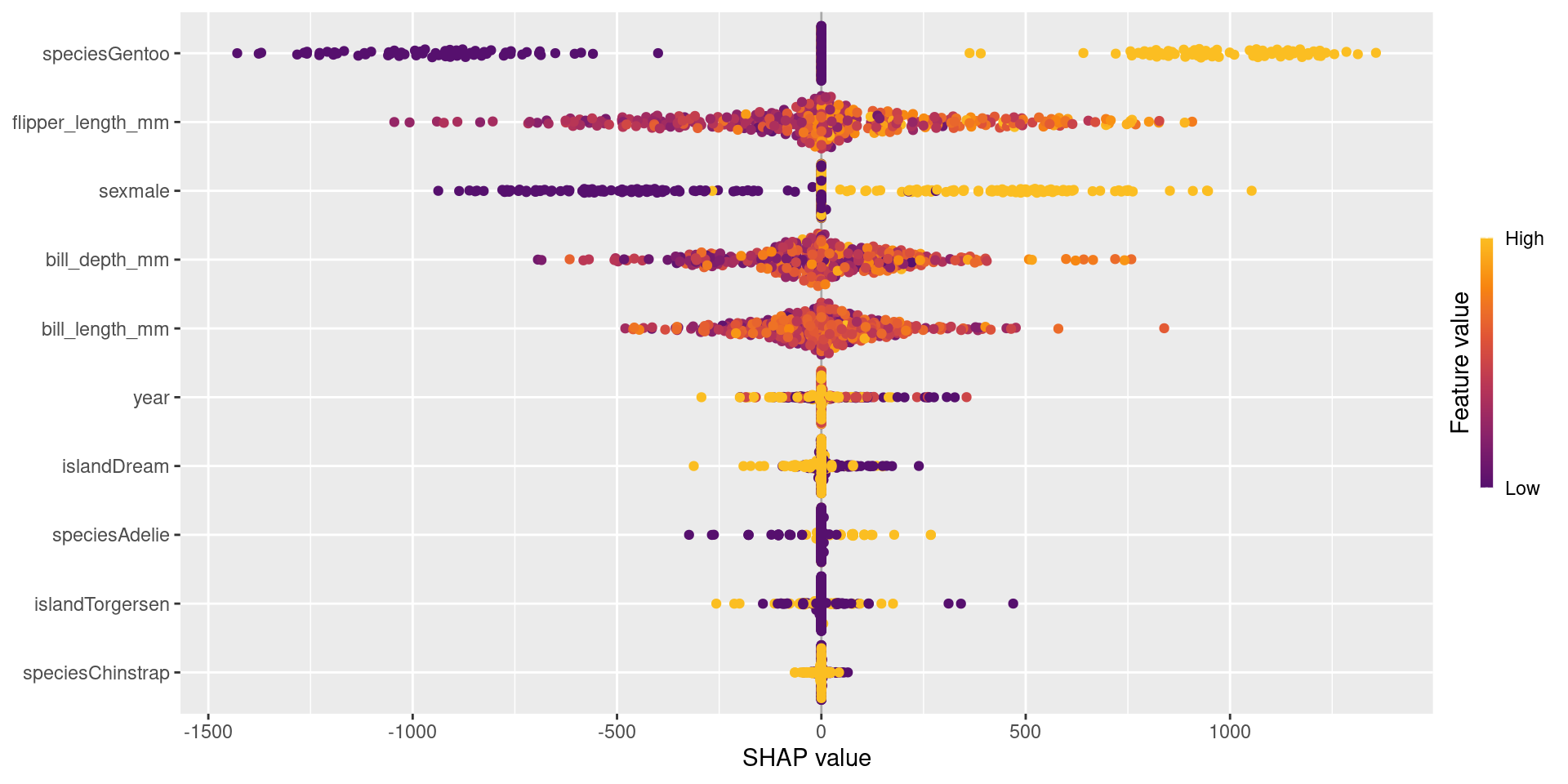
Global Visualization: Summary Plot
sv <-shapviz(shap_vals, X = X)sv_importance(sv, kind ="beeswarm")
The Beeswarm plot shows global importance and how each variable affects the prediction (positive/negative).
Global Visualization: Summary Plot
Each point represents one observation in the dataset.
The x-axis shows the SHAP value, which is the feature’s impact on the prediction.
Positive SHAP values increase the prediction.
Negative SHAP values decrease the prediction.
Features are ordered by importance (top = most important).
The color represents the feature value:
High values are shown in yellow, low values in purple.
For example, flipper_length_mm is very important because it shows a wide spread of SHAP values.
The plot shows both feature importance and how feature values influence predictions.
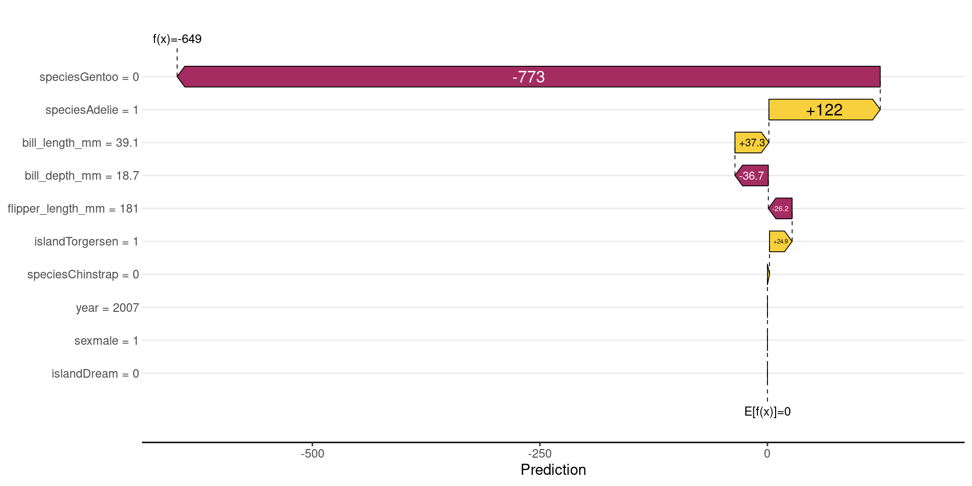
Local Visualization: Waterfall Plot
sv_waterfall(sv, row_id =1)
DALEX often centers the prediction: \(f(x)−E[f(x)]\);
Baseline becomes 0
Contributions show deviations from the average
Shows how we start from the average value and how each variable “pushed” the penguin’s weight up or down.
Local Visualization: Waterfall Plot
It starts from the baseline value (E[f(x)]), which is the average model prediction.
Each feature then adds or subtracts from this baseline.
Bars to the right increase the prediction (positive contribution).
Bars to the left decrease the prediction (negative contribution).
The size of each bar shows how strong the feature’s impact is.
For example, flipper_length_mm has a large negative impact, strongly reducing the prediction.
Other features (like sex or bill_length_mm) increase the prediction slightly.
All contributions sum up to the final prediction (f(x)).
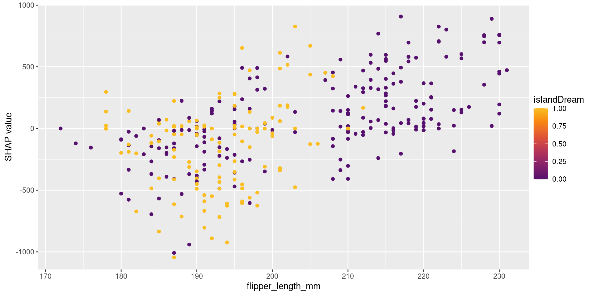
Dependence Plots and Interactions
sv_dependence(sv, "flipper_length_mm")
Reveals non-linear relationships and interactions between variables captured by the model.
Dependence Plots and Interactions
The x-axis shows the feature value (flipper_length_mm).
The y-axis shows the SHAP value (impact on the prediction).
Each point represents one observation.
As flipper_length_mm increases, SHAP values also increase.
This means larger flipper length tends to increase the prediction.
The color represents another feature (year), showing interaction effects.
Points with similar x-values but different colors indicate that the effect of flipper_length_mm depends on year.
When to Use Each?
Use LIME when:
You need extremely fast, simple local explanations.
Use SHAP when:
Consistency and mathematical rigor are fundamental.
You are using tree-based models (use fastshap).
Use DALEX when:
You want a comprehensive toolkit for model exploration (global and local).
You value a consistent, unified workflow (explainer object).
Challenge: Feature Correlation
All post-hoc methods can struggle when variables are highly correlated.
Permutation-based methods (like in DALEX) can create unrealistic data points.
SHAP may attribute importance to variables that are merely proxies for others.
References
Biecek, P. (2018). DALEX: explainers for complex predictive models in R. Journal of Machine Learning Research.
Lundberg, S. M., & Lee, S. I. (2017). A unified approach to interpreting model predictions. Advances in Neural Information Processing Systems.
Ribeiro, M. T., Singh, S., & Guestrin, C. (2016). “Why should I trust you?”: Explaining the predictions of any classifier. KDD.
Molnar, C. (2020). Interpretable Machine Learning: A Guide for Making Black Box Models Explainable.